- Case Study: How We Increased Conversion Rates by 50% for Dutch and Reclaimed AI Visibility - April 14, 2026
- The Top 17 Direct Mail Companies - June 11, 2025
- The 11 Best Landing Page Builder Software Tools [2026] - June 11, 2025
Several years ago, I had the pleasure of choosing a data visualization software tool for my startup.
I say it was a pleasure because it involved getting deep into the business requirements, all of our use cases across the org, and learning about the various tools. From that process, I developed an even deeper understanding of how other teams operated and how data visualization could improve our business decision-making across my company.

I learned which tools worked and which to stay away from. And over my decade+ in digital marketing I’ve used most of the big tools on this list — including Looker, Tableau, Datorama, and Power BI.
The worst tools were:
- Really hard to integrate with data sources
- Slow to update
- Clunky, without a modern user interface
- and super expensive
The best data visualization software tools are those that can be used for a variety of purposes and work out of the box — fast.
These are the best data visualization software tools for every business size and use case.
Table of Contents
What are Data Visualization Tools?
Data visualization software tools allow users to create visual representations of data. These tools allow users to create charts, graphs, and other visuals to help them understand and analyze data. They help business stakeholders answer questions like, “why is revenue dropping this month” or “is our net promoter score (NPS) related to customer lifetime value?”
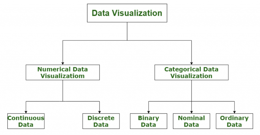
In general, there are two types of data visualization. The best tools enable users to visualize numerical data (revenue, churn, etc.) and categorical data (surveys, word maps, etc.).
Data visualization is important for data-driven organizations because it…
- Helps make sense of complex data fast: Humans learn faster visually, particularly when combing through tons of data.
- Brings consistency to data: Teams can agree on common ways to look at data, without discrepancy.
- Helps uncover relationships: If you’re piping in revenue data, lifetime value data, user data, NPS, and more, it can get confusing fast. Data visualization helps business stakeholders identify trends and correlations, so you can uncover root causes of behavior.
What are the Best Data Visualization Tools?
The best data visualization tools are:
- Friendly to set up
- Have tons of integrations
- Have great customer support
- Easy to navigate and pivot data in
- and have utility across the organization
- And don’t completely break the bank
These are them!
1. Looker: best overall

Looker is a business intelligence (BI) and data visualization platform that enables you to explore, analyze, and share your data. It offers a web-based interface, and supports drag-and-drop reporting, as well as collaboration and sharing features. In 2020, it was acquired by Google for $2.6 billion! As such, Looker is now a part of Google Cloud.
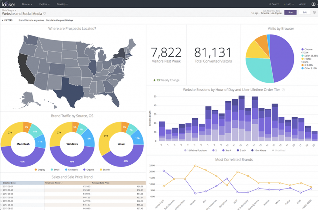
I’ve been part of a Looker implementation and it was pretty straightforward. Like most data visualization tools, Looker setup involves simply integrating with your database software and provisioning accounts for users. The dashboard is completely drag-and-drop; it’s basically one big pivot table. Users can drag fields into their dashboard, overlay date ranges, or slice data by state, customer cohort, and so much more. All of this makes it the simplest data visualization tool for end users.
Features
- Drag-and-drop visualization builder, similar to a pivot table in Excel
- Create charts, create graphs, save reports, schedule reports, and extract insights from any data that lives in the platform
- Because it’s very widely used there are integrations with Segment, HubSpot, Salesforce, and any data warehouse (BigQuery. Plus, Looker has an API.
- Great customer support and training for easy onboarding
- Data is automatically refreshed every hour
Customers
Used by companies such as PayPal, Blue Apron, Airbus, Etsy, The Home Depot, and many more.
Pricing
No pricing information is given, but it’s safe to say Looker will run your organization $5k+ per year.
Bottom line
Looker is my favorite data visualization and BI tool. I love it because it’s simple to use — most stakeholders can become familiar in just an hour or two. Plus, it’s probably the second most powerful tool on this list behind Tableau. And because it’s a Google product, you know it’s straightforward and user-friendly. It is expensive (but less than Tableau), making it really only suitable for mid and large-size organizations.
2. Tableau: simplest to use

Tableau is one of the best choices for organizations that are looking for a comprehensive data visualization tool. It has a wide variety of features and can be used for a variety of different tasks — from financial forecasting, to sales pipeline visualization, to marketing performance across channels. You can basically do anything with Tableau. Plus, it’s probably the slickest-looking of all the data visualization tools out there. And because it’s a very mature business, there are a ton of free support resources. However, Tableau is quite expensive.
Features
- Tableau has native integrations with Snowflake, Google Sheets, Excel, Splunk, Salesforce, BigQuery and more
- Stupid simple drag-and-drop visualization engine
- It is the most beautiful experience of all data visualization tools
- Schedule data refreshes so you’re always working with the latest and greatest data
- You schedule when your data is refreshed
- Enterprise grade security and account provisioning
Customers
Used by companies such as Charles Schwab, LinkedIn, JLL, Hello Fresh, REI, and more.
Pricing
Starts at $840/year, but that only gives you one seat. As such, any organization with more than a few employees will pay much more. This makes Looker the most expensive tool on this list (for most use cases).
Bottom line
Tableau is powerful. I consider it among the best data visualization tools on the market because it’s easy to set up, it’s super simple to navigate, and there is great support and onboarding. It’s truly an enterprise-grade platform. Of course, it comes with a higher price tag.
3. Datorama (Marketing Cloud Intelligence): best for marketers

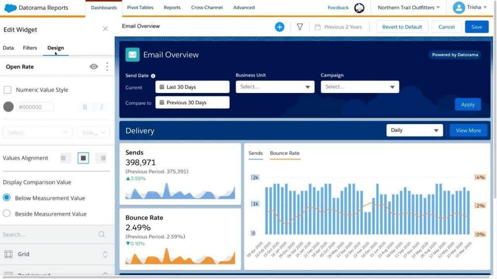
Datorama is a data visualization tool that allows you to visualize all of your company data in one place. It definitely specializes in marketing data, as it has integrations with 60 different marketing platforms, including Google Analytics, Facebook Ads, and Twitter. It was acquired by Salesforce for $800 million a few years ago. It has now been rolled up into Salesforce’s Marketing Cloud. Even after the acquisition, it remains one of the best data visualization tools on the market. But, it comes with a big price tag.
Features
- Direct integration with all Salesforce products
- Easy integration with marketing data, which saves a lot of setup headache
- Pivot all data (easily) by dimensions you set, like channel, campaign, device type, etc. — making it completely customizable
- As it’s a Salesforce product there is extremely robust support
Customers
Used by companies such as Marriott, Slalom, Land O’Lakes, Ticketmaster, B/S/H/, and more.
Pricing
Starts at $3,000/month — like all Salesforce products, it’s quite expensive.
Bottom line
Datorama (now Intelligence), is a powerful suite that covers all of your marketing data needs. While it’s not the best solution for financial teams or support teams (look at Looker or Tableau), it’s bar none the best visualization tool for marketers. The out-of-the-box integrations save a ton of time. Plus, the visualization editor is very user-friendly. Especially if you use Salesforce as your CRM, this may be the right solution for you. However, the price tag is prohibitive for many businesses.
Also read: The 9+ Best CRM Software Tools
4. Google Charts: best free

Google Charts is a data visualization tool built by Google. It allows you to easily create charts from data stored in a Google Sheet. Once you have created a chart in Google Charts, you can share it with others by copying the URL and sending it to them. They can then view the chart on a web browser or embed it in their own website or blog.
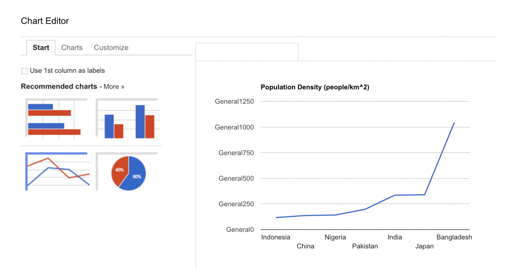
Google Charts is has a few amazing features, including a simple PHP data upload, that almost any developer can navigate. Even more, it’s free! More on that below…
Features
- Data can be uploaded and analyzed via a PHP script
- Charts can be customized, just like in Google Sheets or PowerPoint.
- You can send data to Google Charts from anywhere and you can embed charts in web pages
- Drag-and-drop fields and elements of your chart for a lot of customization
Customers
Used by countless small businesses and enterprise customers — though I cannot locate a list
Pricing
Free to use
Bottom line
It’s great. And it’s free. However, if you have more sophisticated needs, it probably won’t quite cut it. The two downsides: you need a basic understanding of coding to work it and the charts and graphs variety is limited.
5. Microsoft Power BI: best for Excel users

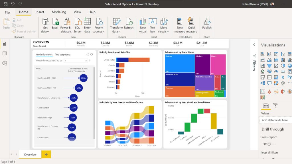
Microsoft Power BI is a data visualization software tool offered by Microsoft. It allows users to create charts, graphs, and maps from data stored in Microsoft Excel or other sources. Charts can be customized and embedded on web pages and reports.
Obviously, one of the best parts of Power BI is the close integration with Microsoft products. As you would expect, Power BI enables a one-click integration with your sheets in Excel and one-click sharing with teammates in Microsoft Teams. As you can see from the image below, Power BI is very closely integrated with Microsoft Excel — so if you’re a Microsoft-loyal company, look no further.
Features
- Custom data connectors to grab data from anywhere
- Hundreds of out-of-the-box data visualization templates
- Share all reports with colleagues in webspaces, in apps, or with Microsoft Teams
- End-to-end encryption and other enterprise-grade security features
Customers
Used by companies such as Procter and Gamble, T-Mobile, Toyota, KPMG and many more.
Pricing
Pricing starts at $9.99 per user per month, making it one of the more affordable tools on this list.
Bottom line
Great tool at a great price. While it’s not infinitely flexible like Looker and Tableau, it’s sufficient for most organizations — particularly those who use Microsoft products.
6. Jupyter: best open-source solution

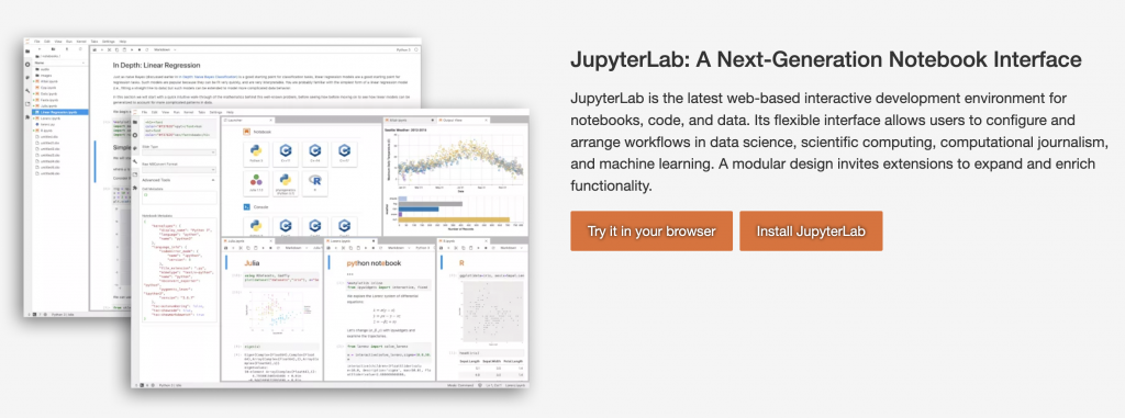
Jupyter is an open-source data visualization software tool that is used to create and share documents that contain live code, equations, visualizations and explanatory text. Jupyter allows users to create documents that can be used to share data insights with others. Because of the price (free) and open-source, it’s used by many universities and large companies.
Features
- Can use in teams with OAuth login or create your own directory permissioning and users
- Supports over 40 programming languages
- Jupyter Notebooks can be shared easily via Dropbox, GitHub, and its native Notebook Viewer
- You can leverage big data tools, such as Apache Spark, from Python, R, and Scala and explore that same data with pandas, scikit-learn, ggplot2, and TensorFlow
Customers
Used by University of Berkeley, NYU, Northwestern University, Google and IBM.
Pricing
Free to use
Bottom line
If you’re very price sensitive and your team is very proficient in one or more programming languages, this is the tool for you. It’s powerful and adaptable because it can all be manipulated and extracted using code. In general, it’s a bit more limited than some other tools and it’s definitely not drag-and-drop. But again, it’s a great, powerful solution.
What are Data Visualization Techniques?
There is no one answer to this question as data visualization techniques can vary depending on the data set being visualized and the goals of the visualization. As you’ve seen, some data visualization is geared for salespeople or finance folks, while other visualizations are made for marketers. However, some common techniques used in data visualization include:
- Charts and graphs
- Maps
- Timelines
- Word clouds
- and just about any other chart or graph that can be useful in visualizing your data
The beautiful thing is that data visualization tools are super adaptable. You can create reports and graphs that have never been made before, just by moving around a few dimensions. So while there are some standard data views (cohort graphs are one that I love), there is infinite flexibility.
How Important is Data Visualization?
Data visualization is very important because it allows people to see data in a way that is easy to understand. This is important because it can help people to make better decisions based on the data. Simple, right? If you’re running a medium or large company, great data visualization can mean the difference between retaining a customer and churning one.
Of course, data visualization is only as helpful as the data you collect. So if you’re still running your organization in spreadsheets or (gasp) on paper, a data visualization tool won’t do you much good. However, if your data is neatly organized in the cloud, you should have a data visualization software.
Best Open-Source Data Visualization Tool
Open-source data visualization software tools tend to be a bit limited. After all, Google and Salesforce have a lot more money and resourcing to throw at a great user experience. However, Jupyter (above) and Charted are really a wonderful open-source tool that are both pretty developer-friendly. They accept data from .csv, .tsv, Google Sheets, and Dropbox links (in the case of Charted).
Google Charts, while not open-source, is a great free tool as well.
Conclusion
There are many different data visualization software tools out there, and the best one for you depends on your needs. Some considerations:
- Which team members will be using the data visualization tool? If it’s just a marketing team, look at Datorama (Intelligence). If it’s just a sales team, you might be able to accomplish everything directly in your CRM.
- How powerful do you need? If you’re an enterprise business that wants to future-proof every element of your data visualization, you probably need Tableau or Looker. But if your needs are less significant, you can get away with a more affordable tool (even spreadsheets).
- What price are you willing to pay?
All the tools on this list are fantastic for a variety of use cases… at a price. Choose wisely, as it’s a bit cumbersome to implement (or rip up) an existing data visualization tool. And remember, Google Sheets and Microsoft Excel are still favorites for creating simple charts and graphs — so be completely sure you need a tool in the first place.
