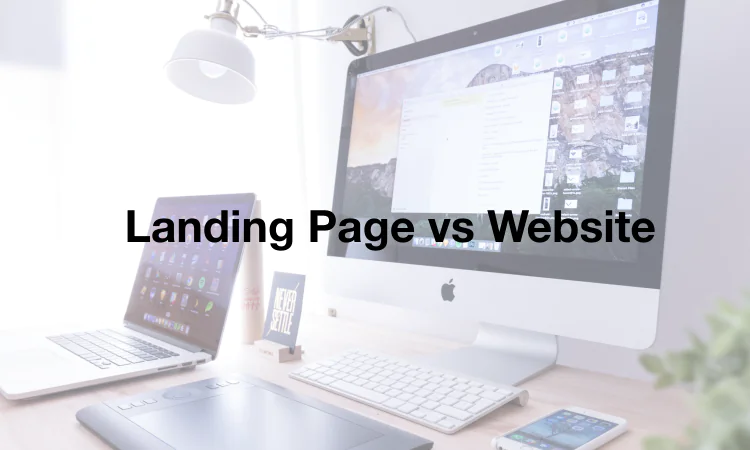
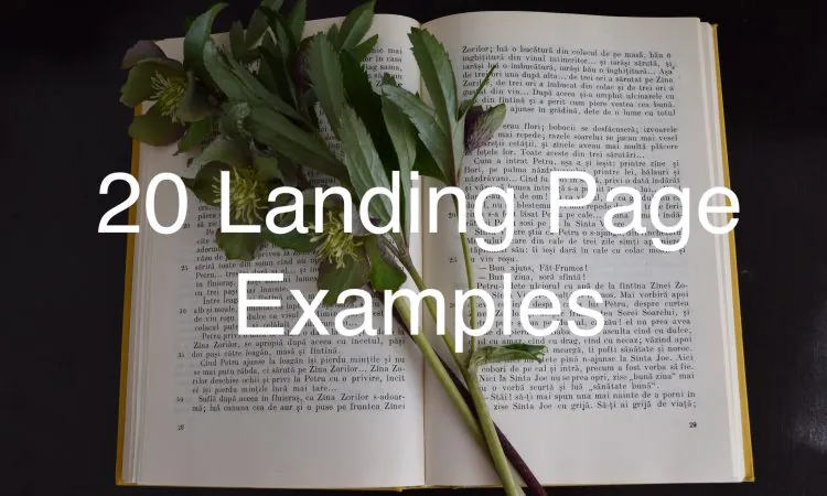
- 20 of the Absolute Best Landing Pages for 2026 - June 11, 2020
Landing pages are great for capturing leads and gathering customer information. Plus, they can be really easy to build with the right landing page builder.
What you might not know, however, is how to design a landing page that is revenue-driving.
Designing a high-converting landing page shouldn’t be a huge challenge. Of course, you should always A/B test and rotate in new concepts as your brand grows. But most successful landing pages have a few things in common — this list will help you figure those out.
So if you’re looking to spice up your landing pages and increase your conversion rates, check out these 20 real-world cases.
Table of Contents
1. Rover
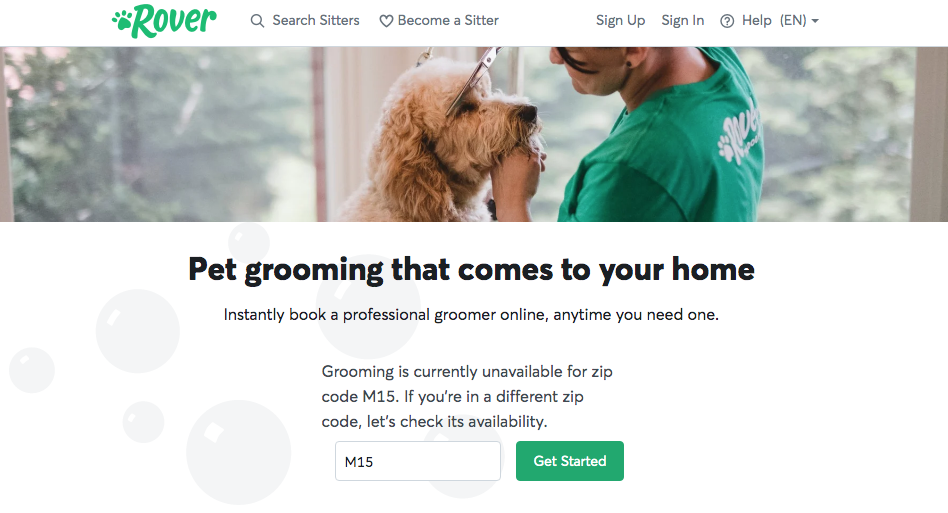
Why it converts: You don’t need to bombard website guests with a tremendous amount of information on an individual landing page. On the contrary, as this example from Rover demonstrates, it often makes more sense to be clear and concise. Getting to the point quickly reduces the odds of guests becoming distracted (and not taking the desired action as a result).
2. Winc
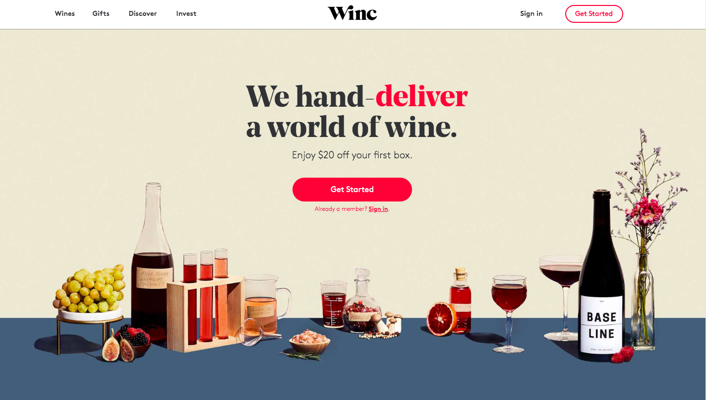
Why it converts: Strong visual content can play a very important role in your landing pages. This example from Winc illustrates how you can still embrace simplicity, while using relatively striking colors (like the shades of red shown here) to highlight important words and calls-to-action. You need to choose colors that correspond with your brand while also capturing the attention of your targeted traffic.
3. HelloFresh
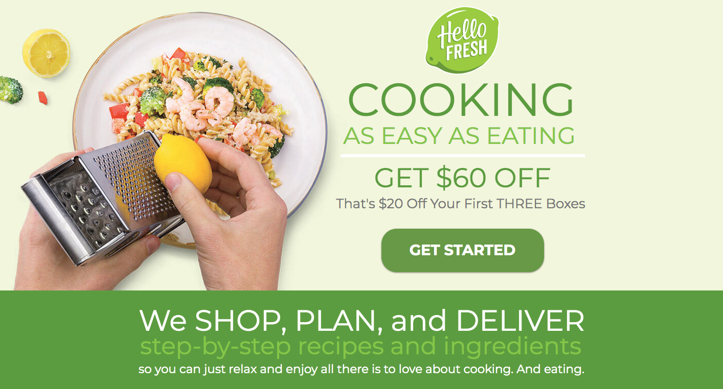
Why it converts: A useful rule of thumb when writing product description copy is to focus on benefits instead of features. This guideline also applies when writing landing page copy. Consider this example from HelloFresh. “Cooking as easy as eating” is a simple bit of copy that clearly and enticingly describes the benefits HelloFresh offers.
4. FabFitFun
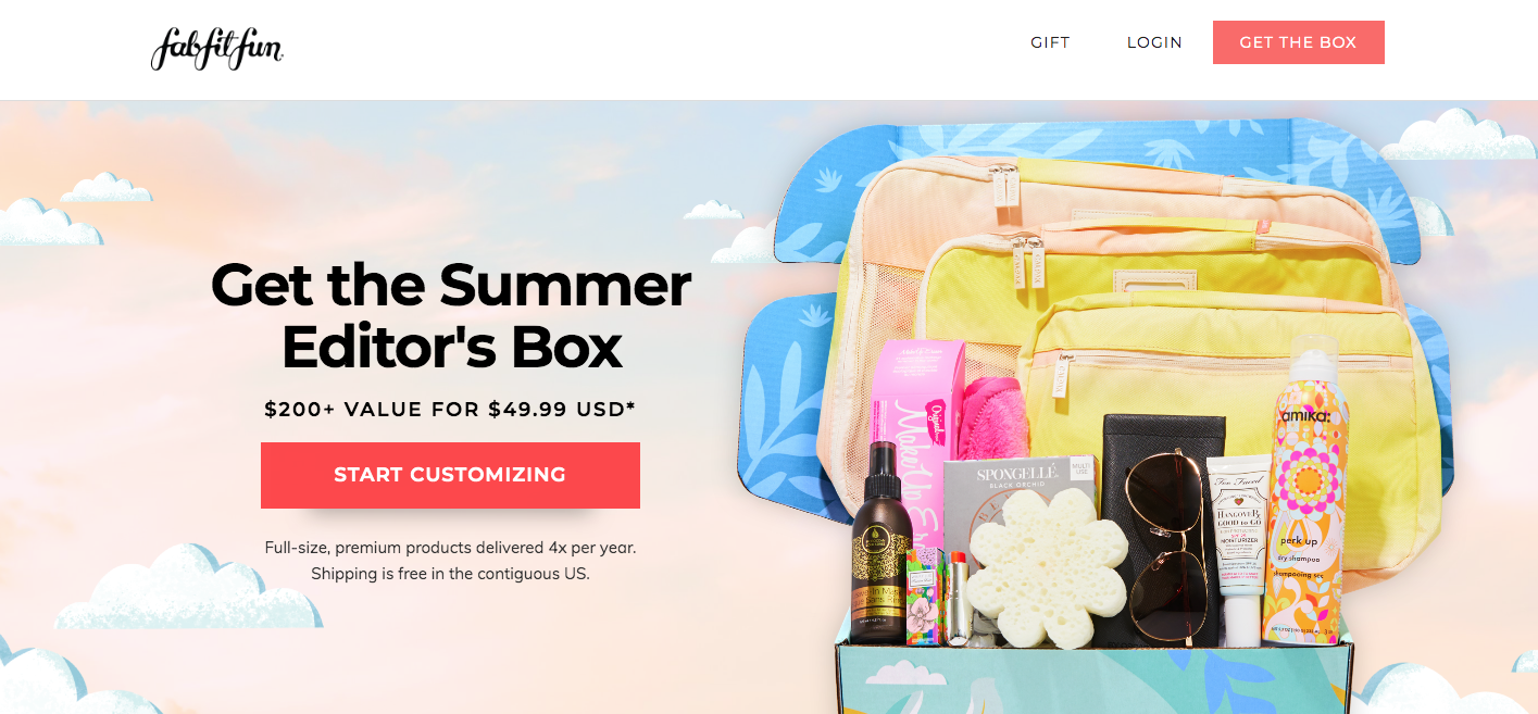
Why it converts: Sometimes it’s important for a landing page to clearly show what a customer will receive if they order a given item. This is particularly true in the case of gift boxes, which may include multiple items. FabFitFun’s landing page is a strong example of a page that eliminates concerns and apprehensions.
5. Pokemon
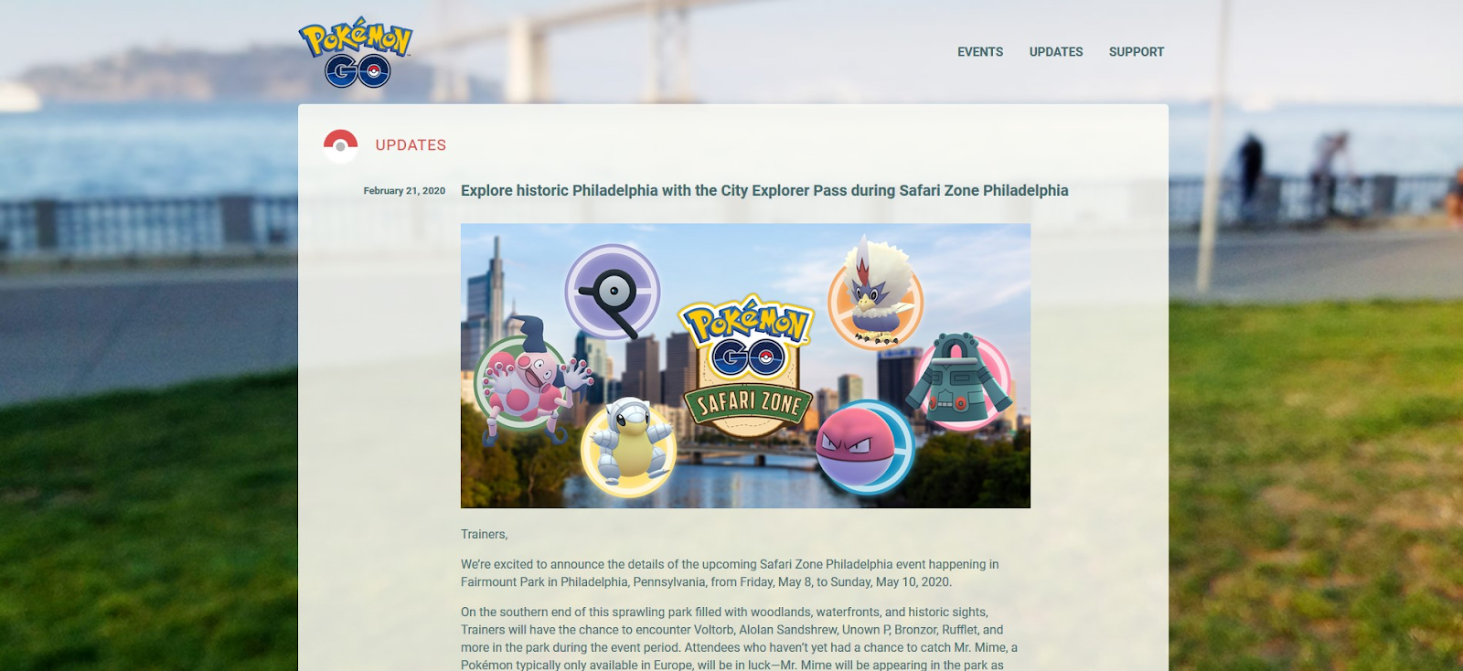
Why it converts: Although simplicity is often key to an effective landing page, there are instances when it’s appropriate to include long-form content. For instance, this example shows how a landing page can introduce users to a new product or service in the form of a press release.
6. AirBnB
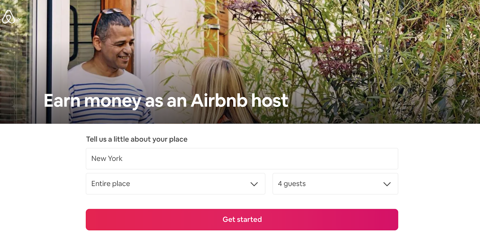
Why it converts: Research from Epsilon indicates approximately 80% of consumers are more willing to make a purchase from a brand that offers personalized experiences. That’s what makes this AirBnB landing page effective. It allows guests to enter information about themselves to learn more about what the product can offer them in a personalized manner.
7. Shopify
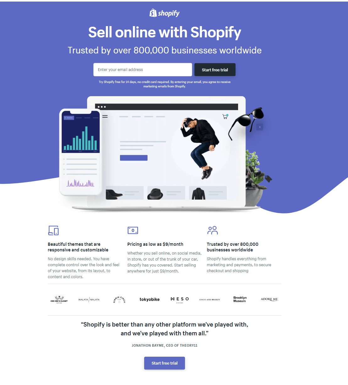
Why it converts: Social proof is the idea that consumers are more likely to make a purchase from a brand when other trusted parties recommend it in some way. In fact, a survey has shown that this is true for 66% of customers. On this landing page, Shopify leverages social proof by stating “800,000” businesses worldwide use and trust their product.
8. Nauto
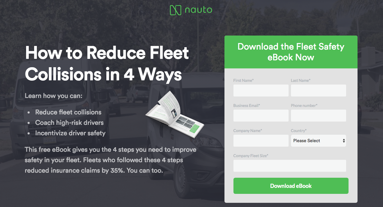
Why it converts: Sometimes a product offers highly-technical benefits that can be difficult to highlight in a single landing page. Nauto is one example. This company offers a product designed to improve vehicle fleet safety. The company manages to address the challenge of promoting its complicated product via a landing page by offering users a free eBook describing it in greater detail.
9. Viva Animali
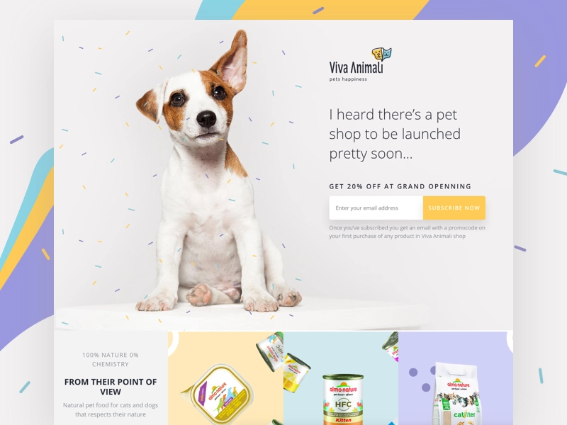
Why it converts: It’s often smart to include images that evoke positive emotions on a landing page. The Farmer’s Dog achieves this with a landing page featuring a cute image of a dog that would immediately appeal to the brand’s target audience.
10. HubSpot
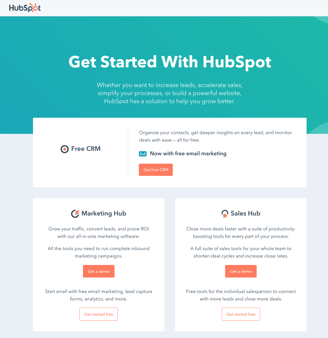
Why it converts: Depending on the nature of your products, you may be targeting multiple types of leads. This example from HubSpot illustrates how you can target multiple audiences via a single landing page with segmented calls-to-action.
11. EF Ultimate Break

Why it converts: Sometimes customers may have questions about specific types of products. If you suspect this is the case, it’s a good idea to include answers to frequently asked questions directly on a landing page. Potential leads need to thoroughly understand your product before deciding to make a purchase. Check out these Shopify examples to see how other e-commerce store owners are using landing pages.
12. Casper
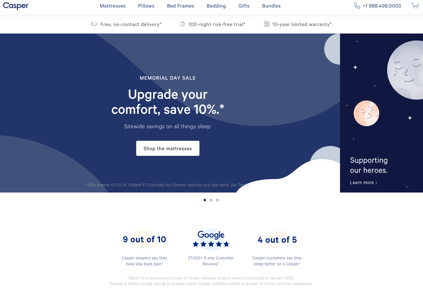
Why it converts: By now, you’re probably wondering how a landing page can include social proof, offer a discount, incorporate visuals, and offer a simple but effective call-to-action without appearing too cluttered. This example from Casper proves it’s entirely possible to “cover all your bases” while being clear and ultra-concise.
13. TouchBistro
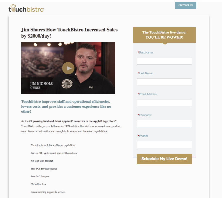
Why it converts: Don’t make the mistake of assuming a landing page’s elements need to be limited to text and static images. There are times when including videos will increase conversions as well. You can’t see it from this image alone, but the video in this landing page is a short testimonial, by a client. It shows visitors exactly what TouchBistro could do for their business by scheduling a live demo.
14. Athletic Greens
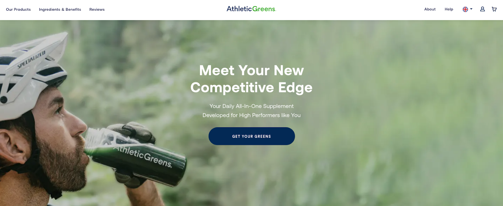
Why it converts: You need to make sure guests notice your call-to-action. One way to do so is to use contrasting colors to ensure a call-to-action stands out, like the one on this Athletic Greens landing page. It also includes an image of a man drinking the actual product.
15. Ancestry
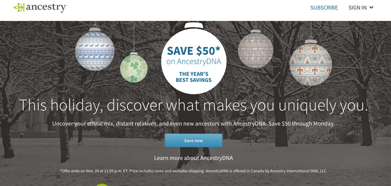
Why it converts: Creating a sense of urgency is one of the most effective ways to boost conversions. This landing page by Ancestry creates urgency by highlighting a sale that’s ending soon. The CTA is a great call to action example as the words “save now” drive home what makes this landing page different.
16. Curology
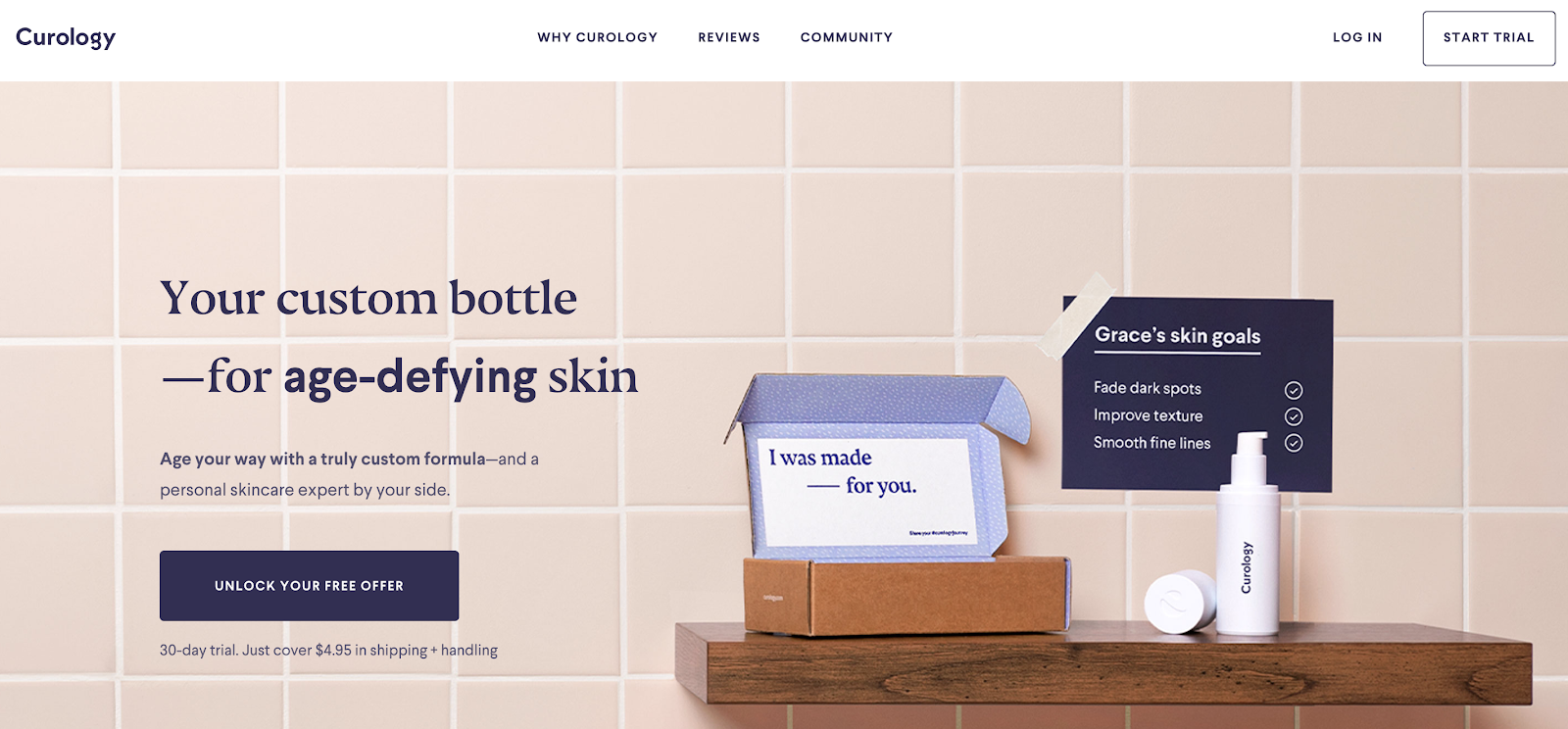
Why it converts: The CTA is bold and contrasting, which draws attention to the offer of the landing page. The offer, a 30-day free trial, removes any apprehensions the user may feel. The image of the product highlights the personalized service that they will receive if they do convert.
17. Offset
Why it converts: This is a very good example of a landing page because it focuses on the benefits of convenience. The headline and copy are short enough to get the point across quickly but specific enough to clearly let the user know that they will solve their problem. Your goal should be to strike that same balance when writing landing page copy.
18. Hootsuite
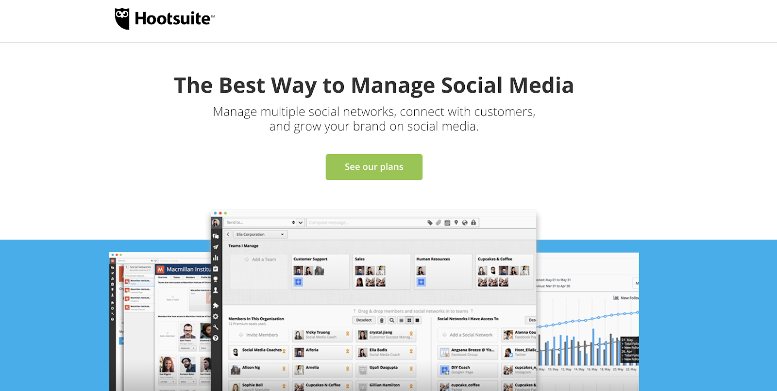
Why it converts: Sometimes a product can serve multiple purposes. Hootsuite’s landing page demonstrates how a simple image can depict a product’s functions without overwhelming a guest with too much unnecessary visual content.
19. Percolate
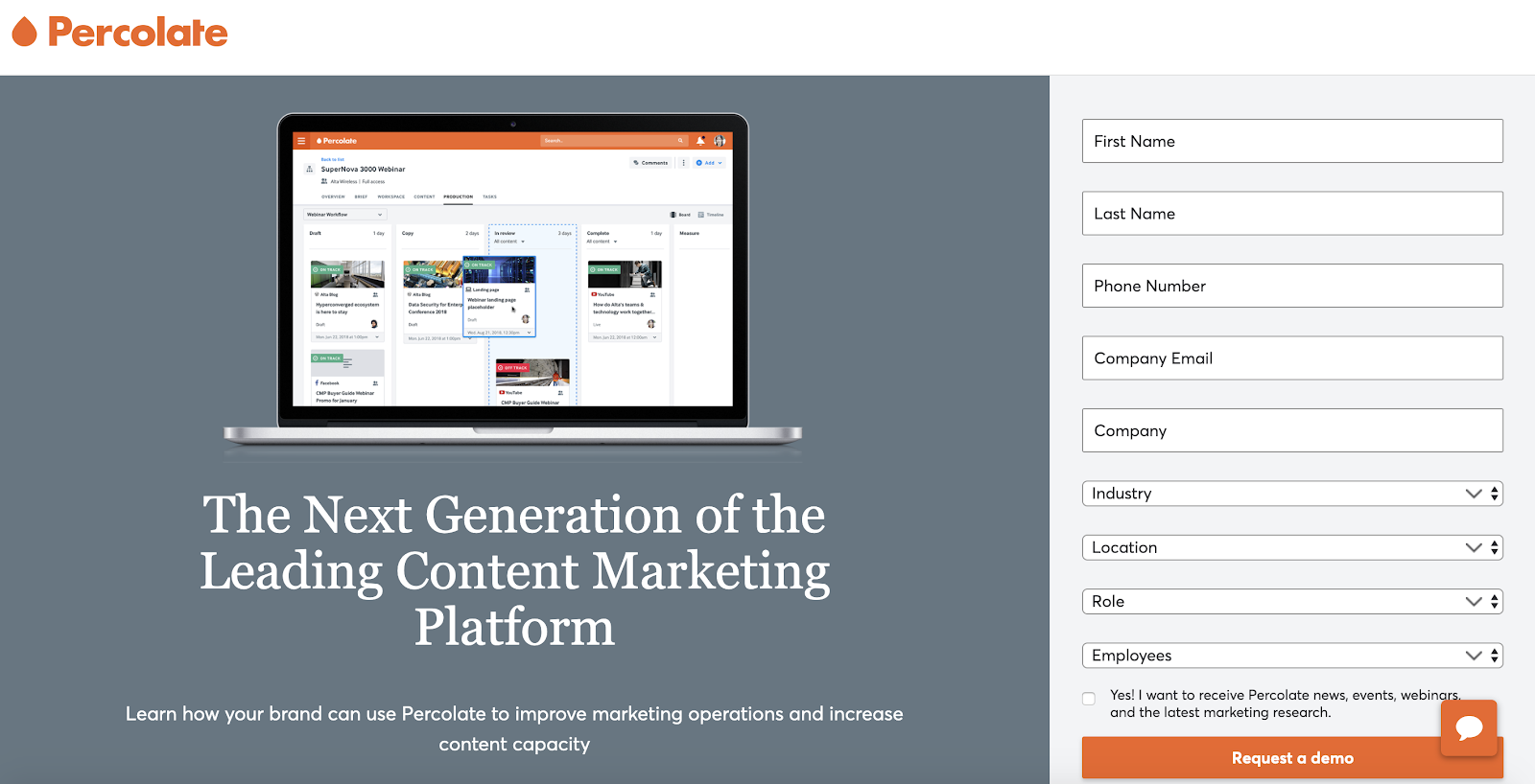
Why it converts: This landing page from Percolate is a lesson in proper organization. The image is clearly separated from a section of text below it and the form to the right of it. This ensures a guest can easily digest all the information being presented. Additionally, the organized simplicity of the landing page drives the user to fill out the form. The form will likely be connected to a marketing platform so that the company can follow-up with the users by sending them emails for customer onboarding.
20. Mayweather Boxing + Fitness
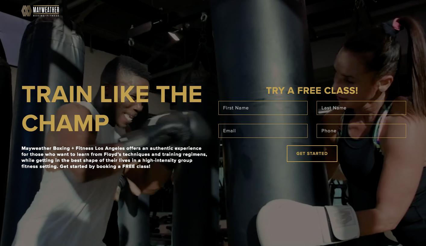
Why it converts: A previous example from this list (TouchBistro) indicated how it can be helpful to include videos on a landing page. This example is slightly different, as the video auto-plays in the background, instead of requiring a guest to click on it to play the video. This makes the overall page more dynamic and striking.
Conclusion: Designing Landing Pages that Convert in 2020
All of these examples are unique. However, they do share a common trait: they represent landing page design and copy principles that drive conversions. Although the nature of your products may be different from the products and services highlighted here, keeping these examples in mind when designing your e-commerce landing pages will help you significantly increase conversions.